
Google, with the arrival of the next version of Android, is once again renewing the design of its applications to adapt to the new scheme they have developed. A redesign of such caliber had not been seen for a few years.
This new design, called Material Theming, comes to replace the Material Design that was applied a few years ago on Android and plans to change the appearance of the vast majority of Google applications to create a homogeneous ecosystem in terms of the design of its applications.
Gmail was the first service that could test this redesign. We already taught you how to activate the new Gmail design and we discussed some of its new features in another article. Now these changes that affected the web service will also appear in the app for the different operating systems in which it is available, and like many other applications in the family.
Material Theming follows in the footsteps of its predecessor and seeks to offer a clean design, with few visual loads, but offering a structure with colors that can facilitate the task of users to easily recognize each of the options of the services in which it is applied. this redesign.
Article Content
gmail

Google's email service was the first to be affected by the design changes that the big G is applying to its applications. You can see an interface with a much lighter and cleaner color. There are many more white spaces than before and colors play a fundamental role in being able to delimit and identify each of the sections of the service.
The main idea is to focus the user's attention on the content and not on elements that can distract from the main idea (reading and writing emails). Some buttons, such as the reply button, and conversations have changed appearance. In addition, new functions arrive such as Smart Compose that are added to the interface.
Do you want to enjoy the new Gmail design now? Click here and find out how to activate the new Gmail design in your inbox.
Google Maps
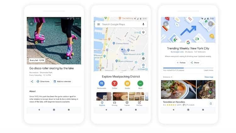
It's been a while since Google Maps had a facelift, and this is really important. It is not yet available in the application but they have already shown us what it will look like thanks to different images that the same company released.
Google Maps will give more importance to discovering places making use of your application. Although it was something that could already be done with its maps, on this occasion the exploration options and personalized recommendations of the app will be much more important with this update.
Google News
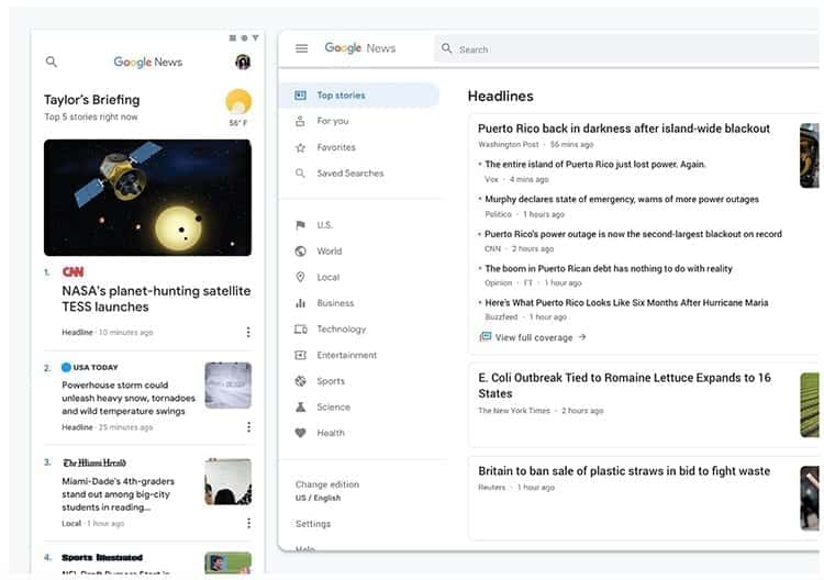
This is the second application that has already received its new design and can be enjoyed both in the application and on the website. Google News had fallen into disuse by many, even Google itself had left it a bit aside, but with this redesign they want it to come to life again.
Now the design is much cleaner and everything focuses on the different fonts available to be able to read the content that has been published. No less than twelve different styles of Google Sans typography.
The style of the letters and articles are now sliders to make using the application easier and the sections are separated so you can have everything well organized and know where to look when using News.
Google Home
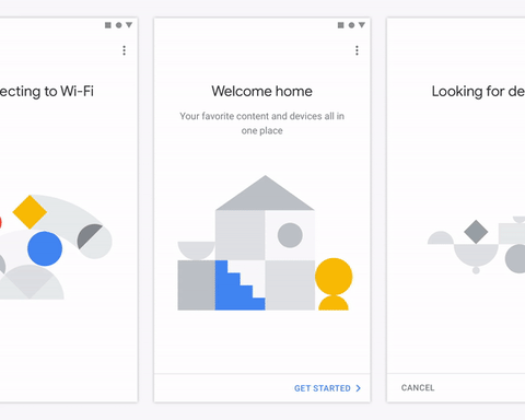
The more smart devices there are in your home, the more important it will become. Google Home for you. This is the application that is responsible for controlling all smart devices, such as Chromecast. A place where you can synchronize and control all these products, having everything at hand in a single application.
With this new design everything is focused on the home screen. From this screen you can configure the WiFi connection and activate the different devices. Each step has its own screen so the user can focus on setting up the equipment and nothing else.
Google Pay
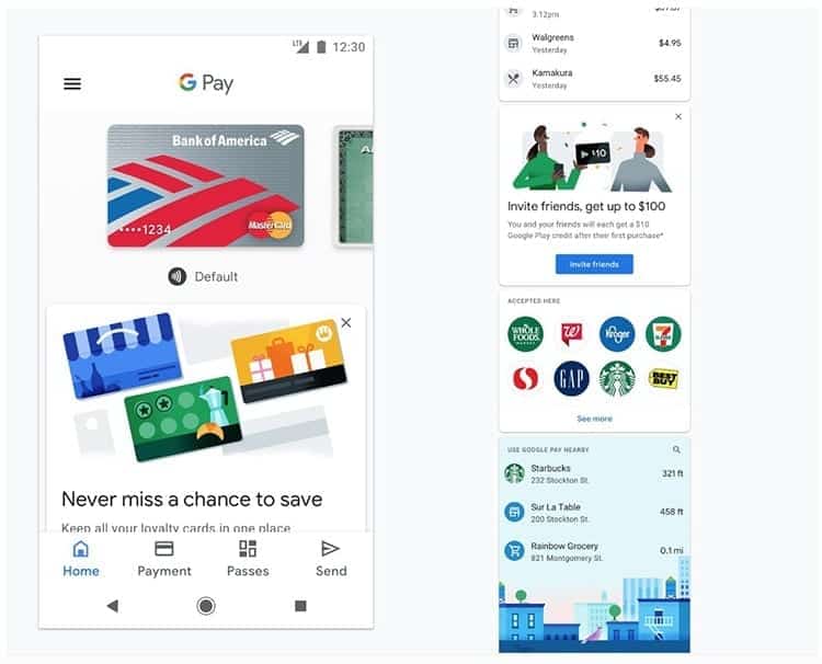
While other Google apps look for more white spaces, Google Play adds a little color with this new design but cleaning many sections. This is Google's payments app, which, although relatively new, will become quite relevant in the future, and competes against other services such as Samsung Pay and Apple Pay.
The cards are a very important feature in this application, in the same way that the avatars and circular images will be responsible for encouraging users to click in order to discover new establishments to visit and see past transactions.
Google Play Games

The Google Play Games application (or Google Play Games) It was one of the first applications that enjoyed this new design. It is characterized by offering much larger images on the game covers, as well as there is a lot of white space. But the application now focuses more of its efforts on showing the accumulated experience and levels of each user.

I have been glued to a monitor since a PC fell into my hands in 1997. Now I like to write about everything related to them.
Content writer. Graphic Designer and Search Engine Optimization


